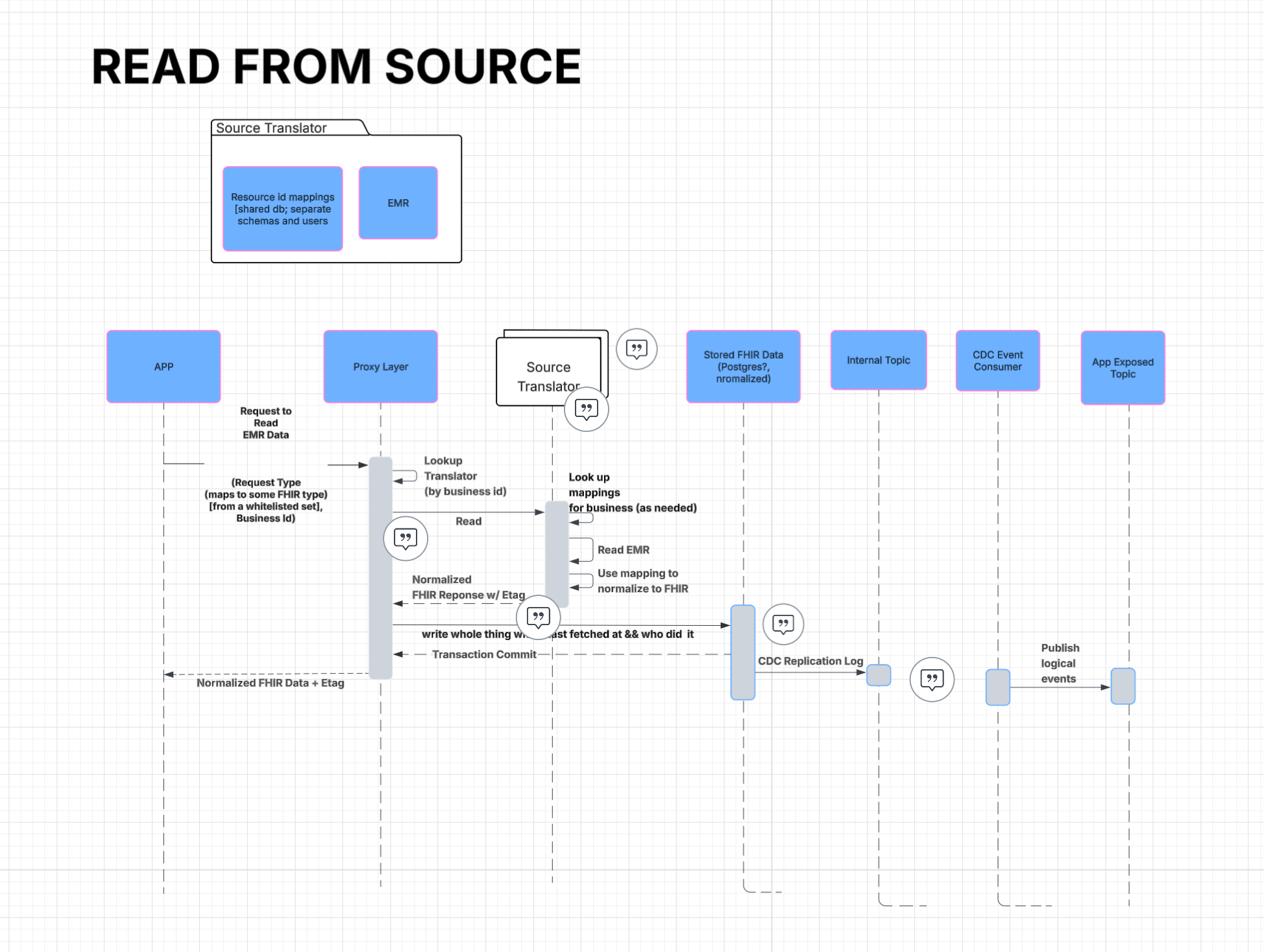
At 3 AM, a scheduled caregiver doesn't show up for her shift. Within minutes, our autonomous agent texts three backup caregivers, leaves voicemails for the client and logs the incident as an open issue. The agent then works the situation. By 7 AM the on-call coordinator picks it up — alongside however many other overnight escalations are waiting — and her job is to figure out, quickly, what the agent did, what worked, and where she needs to step in.
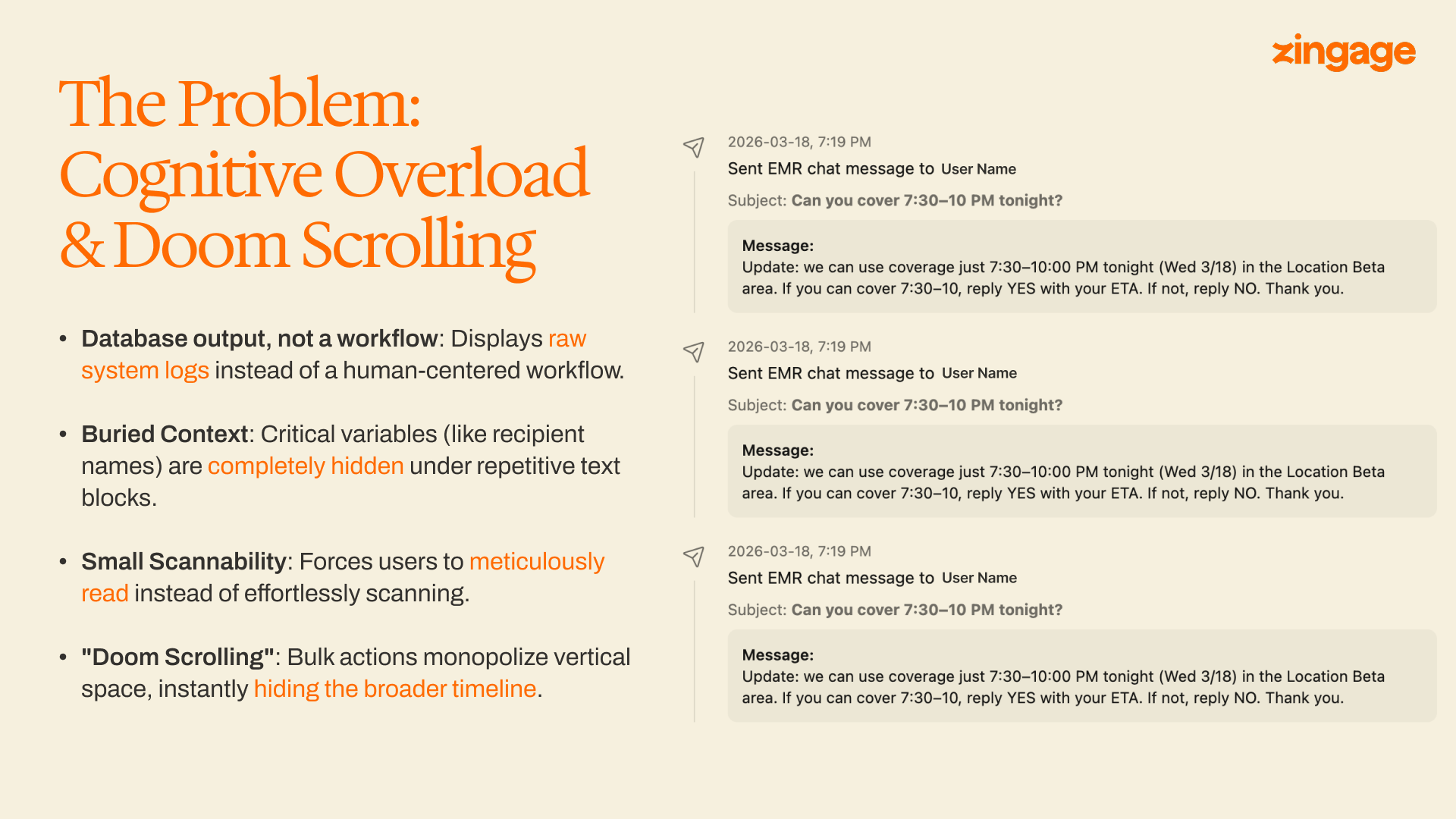
For months, what she opened was closer to a database dump than a timeline. Nine near-identical "Sent EMR chat message" entries, each a paragraph of metadata: timestamp prefix, recipient name buried mid-line, full message body, status code. To find out who the agent had reached, she had to read most of every entry. The data was all there. The interface surfaced almost none of it usefully.
This is the standard failure mode for an interface built as a thin skin over an event stream: faithful to the database, indifferent to the person doing the work. Coordinators don't slow down to read. They pattern-match, triage, and move on. When a UI doesn't match that rhythm, they route around it. Which means they route around us.
The Diagnosis
None of the four issues below are unusual on their own. Together they made the timeline functionally hostile.
- A log, not a workflow. Every agent action — sending a text, posting a comment, transitioning a status — rendered as a flat system entry of the same shape. There was no surface-level difference between "the agent sent a message" and "the agent escalated this to a human." Both were just sentences.
- The most important field, buried. When a sent-message event matters, the field you need first is who received it. In the old layout, the recipient name appeared after a timestamp prefix and a type label — eight or nine words into a paragraph. To answer "who did the agent text?" a coordinator had to scan past two pieces of structural metadata before reaching the content she actually needed.
- No visual hierarchy. Same typography, same indent, same row height for every event. State transitions, sent messages, system notes, and human comments all looked alike. Nothing popped because nothing was allowed to.
- Doomscrolling on burst actions. Coverage outreach commonly produces a burst — the agent contacts ten or twenty potential backups within a few minutes. In the old design every event got a card-sized vertical slot, so a single burst could fill the viewport and push the structural events below the fold. Coordinators routinely lost the shape of an issue inside its own activity.
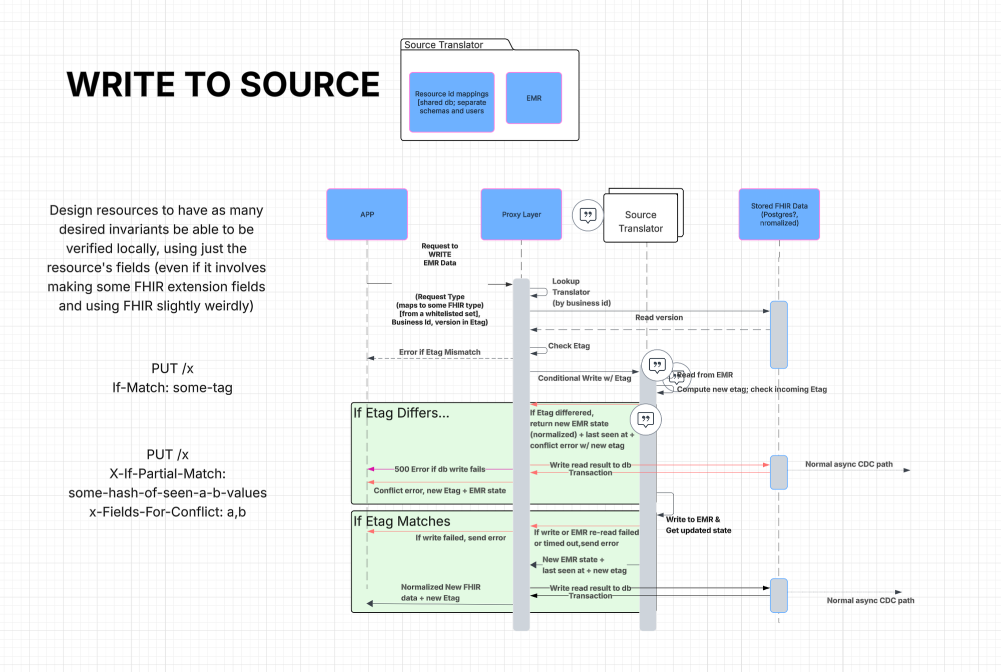
How we approached the redesign
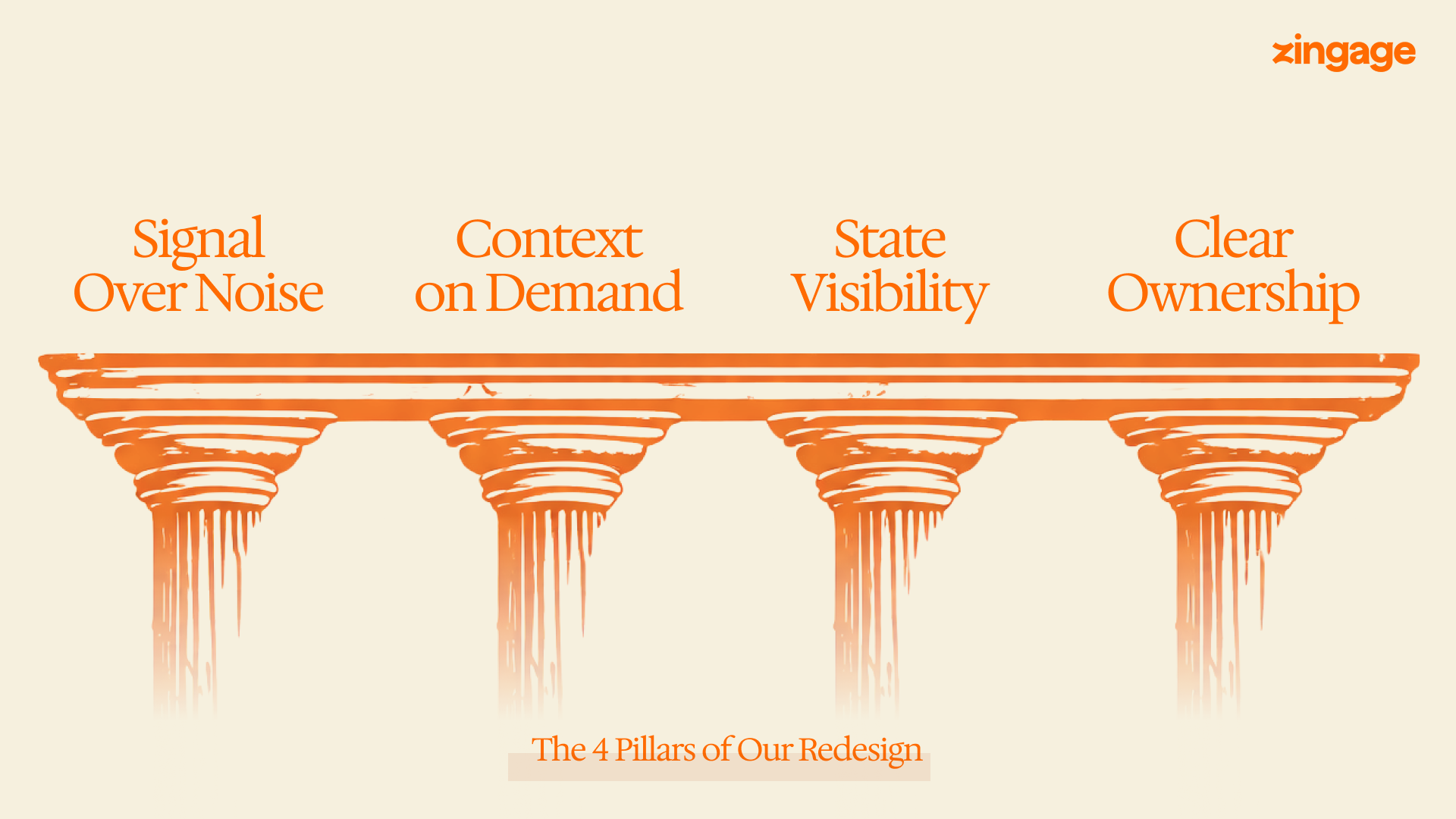
A timeline for operators is a specific thing. It is not a feed, not a notification stream, not a log. It is the primary surface through which a human reconstructs a sequence of mixed human and machine decisions under time pressure. Before writing a line of new UI, we named what a great one had to do.
There was no blank-slate moment. The timeline was already in production, used every day. Any redesign had to ship as a drop-in replacement on the existing data model — no schema migration, no historical-data backfill.
Pillar 1: Signal Over Noise
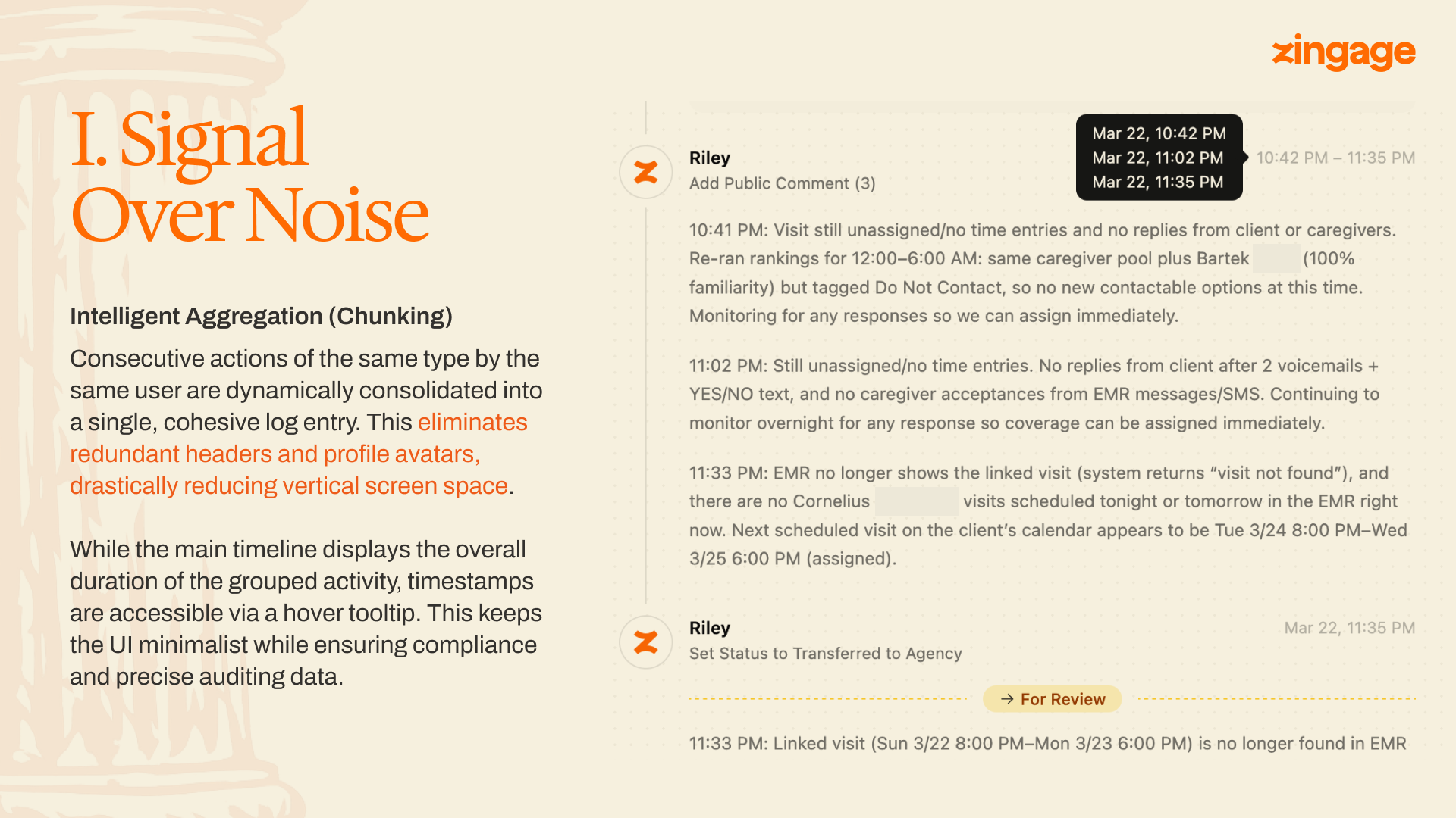
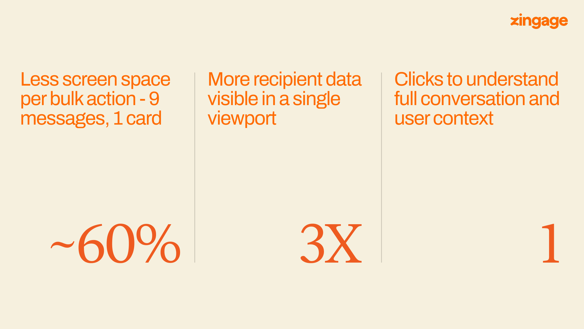
We collapse runs of same-type events from the same actor into a single card. Twelve "Sent EMR chat message" events from the same agent within a short window render as one card — Send EMR chat message (12) — with a compact list of recipients beneath it. Each recipient row leads with a bolded name, followed by a one-line message preview and a status tag.
Per-event timestamps live in a hover tooltip on each recipient row. They aren't removed, just deferred — auditability preserved without paying for it on every glance.
Pillar 2: Context on Demand
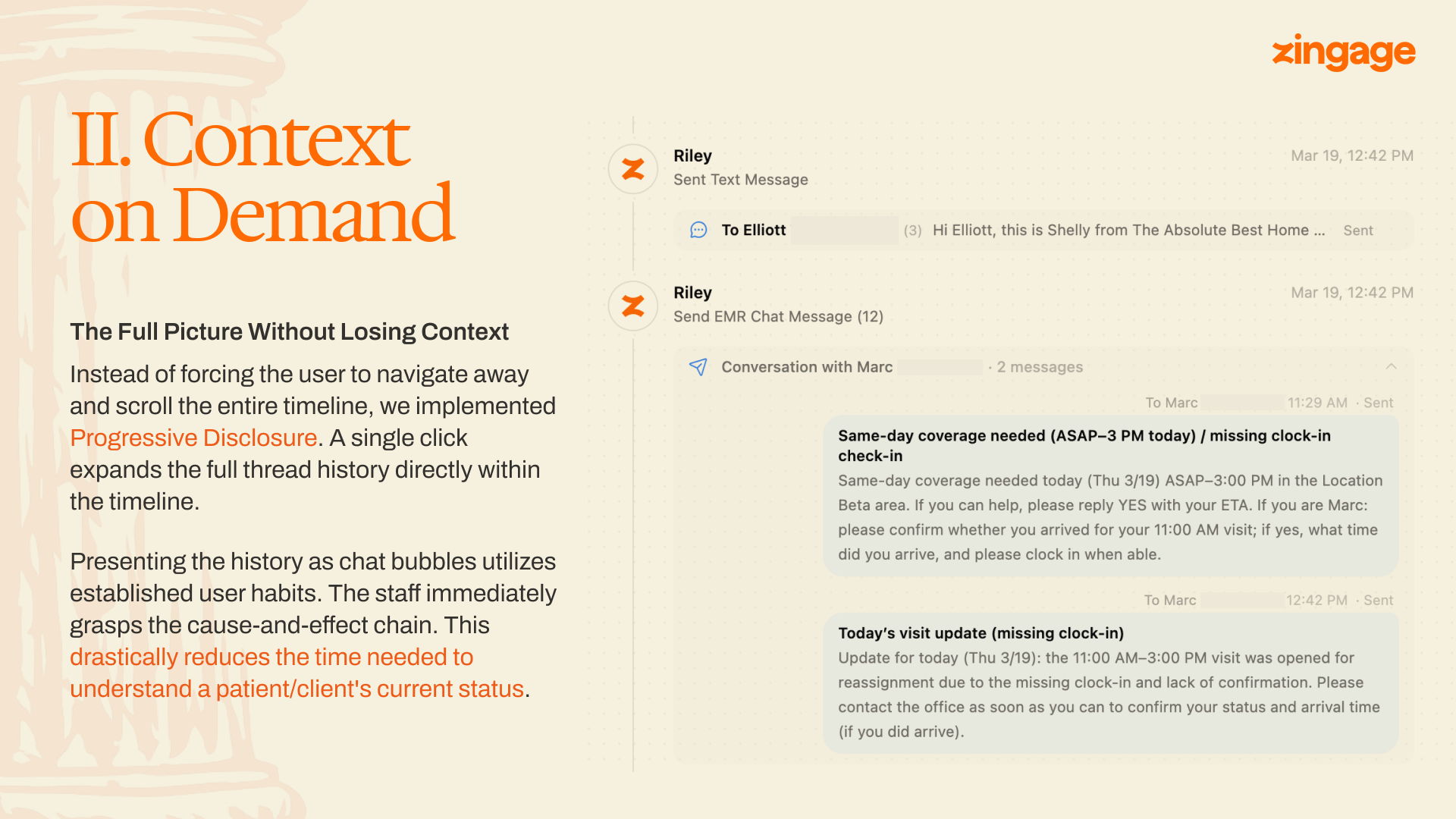
Progressive disclosure is unremarkable as a principle. The interesting question is where to put the disclosure boundary.
The new UI expands a sent-message card in place. Click the card and the full thread opens beneath it as a chat-bubble stream — caregiver replies, agent follow-ups, rejections, acceptances — in the visual format people already use for messaging.
A chat bubble carries causality cheaply: who answered whom, in what order, with what tone. The breakthrough wasn't the format itself; it was matching the format to a genre coordinators already know how to read.
Pillar 3: State Visibility
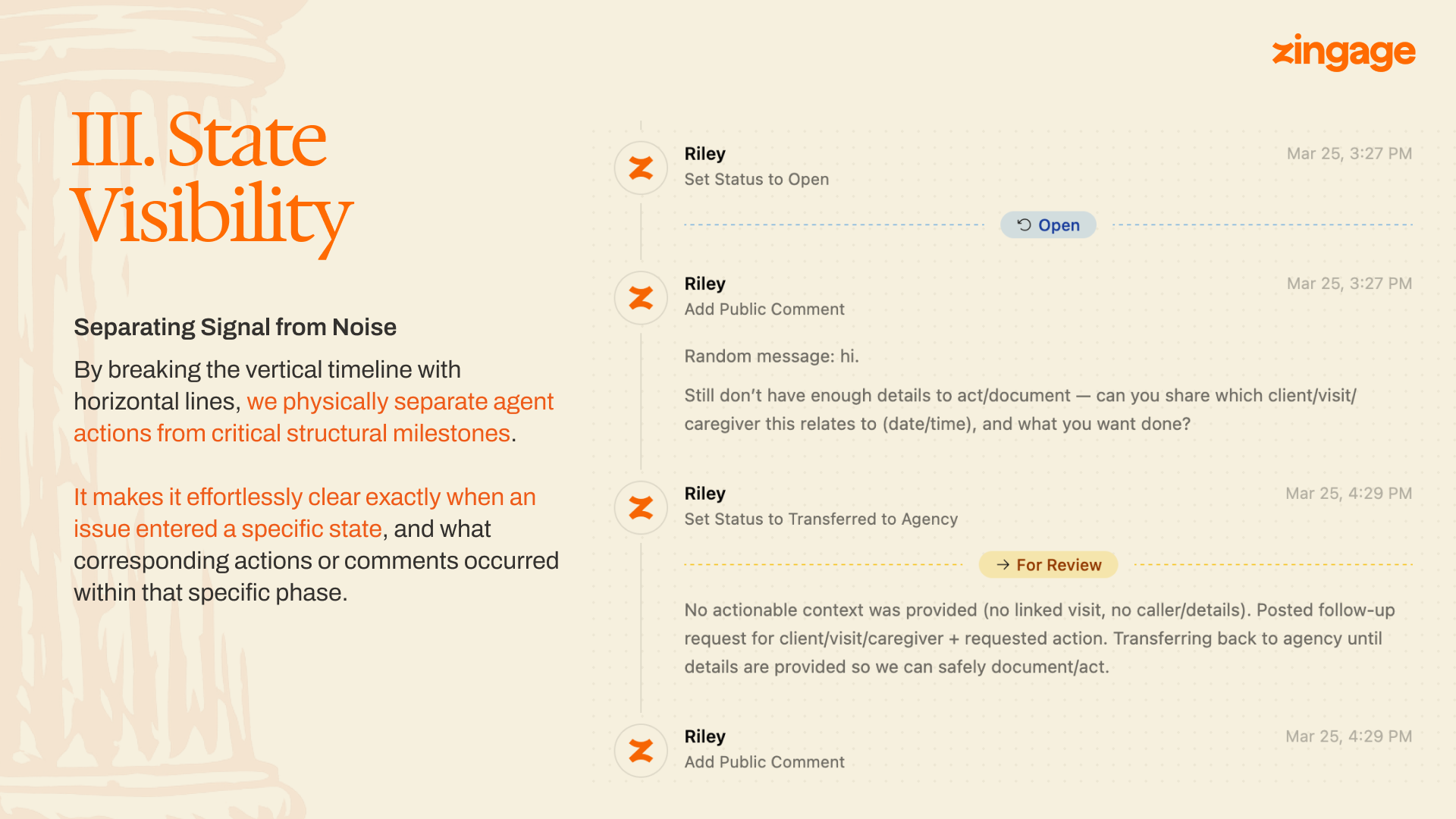
The timeline carries two kinds of information: events and states. The old design treated them identically, which meant the issue's state lived nowhere visually — you reconstructed it by reading.
The new timeline breaks at every state transition with a horizontal rule labeled with the new state and the time of transition. Scrolling an issue, you see the skeleton first: opened at 3:27, escalated at 3:45, transferred at 4:29, resolved at 4:52. The events between the rules are the meat. The rules themselves are the bones. A coordinator orienting to a new issue reads the skeleton in under a second and dives into whichever bone-section is relevant.
The other piece of state is the present tense. When an agent is actively working an issue — calling, posting, waiting on a reply — the issue footer shows a live indicator. This is the question coordinators asked us about most often, in one form or another: is the agent still on this, or has it given up and is this now on me? In the old UI, ambiguity defaulted to "I'd better check," a tax on the coordinator's time on every issue. The indicator answers without being asked.
Pillar 4: Clear Ownership
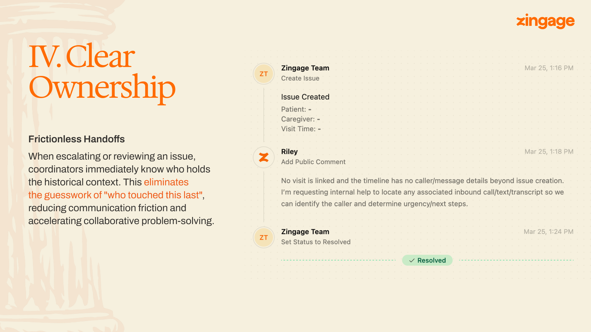
Every event on the timeline carries an author: name, avatar, timestamp, in that visual priority. The bolded name is the fastest piece of information on the card.
This sounds like cosmetic discipline. It matters most on handoffs. An issue that gets escalated to a human, transferred back to an agent, then closed by the customer touches three actors. The coordinator picking it up needs to know whose context she's inheriting. The rule we hold to is straightforward: no event renders without an explicit author.
Mobile
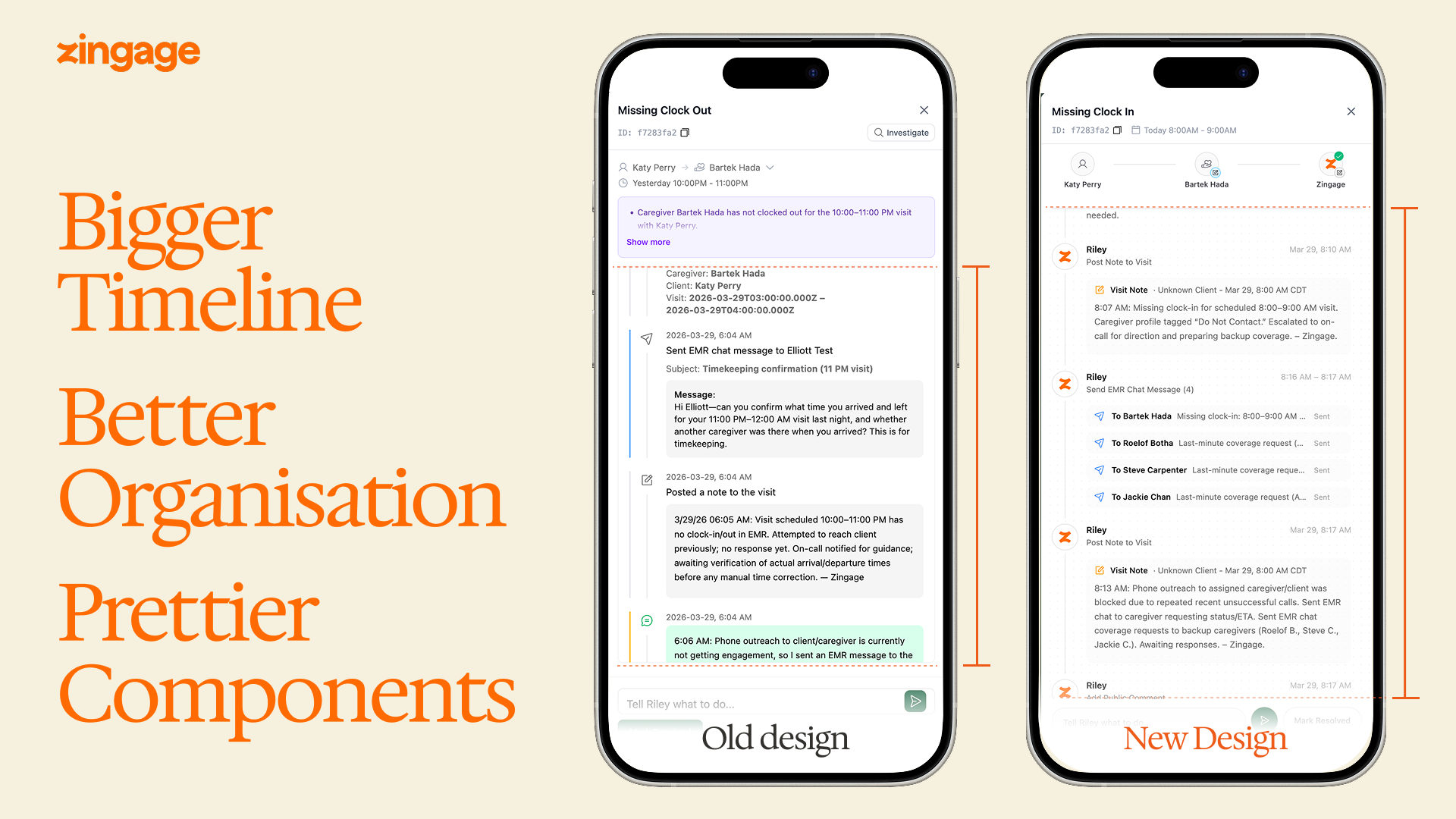
Enterprise software historically treats mobile as an afterthought, which is strange, because a coordinator on-call is almost never at her desk. The new timeline is the same timeline — same aggregation, same event cards, same expandable conversations — fit to a phone. The old mobile view was effectively unusable for anything but the simplest issue. The new one is the one coordinators actually use.
What this taught me
The coordinators we build for are triaging real situations — a missing clock-in is a missing caregiver is a patient who may or may not have gotten their meds. The design budget should reflect that. A few hundred milliseconds saved on a triage flow, multiplied across a shift, multiplied across every coordinator in every agency we serve, is time that goes back to the people who need it.
And finally — Every choice in this redesign has trade-offs. Aggregation buys scannability at the cost of direct timestamp visibility. We pay it back through tooltips and expansion, but we don't fully neutralize it: a power user who wants to see all twelve timestamps at once has more clicks than before. The right call depends on who the surface is for. Ours is a coordinator under time pressure who needs to triage fast without missing anything. If a similar timeline is being designed for forensic reconstruction — post-incident review, compliance audit — the defaults probably flip: more density, less aggregation, timestamps surfaced rather than deferred.
We're hiring engineers who care about this kind of work. Open roles: jobs.zingage.com.